
Change how the kitchen display looks
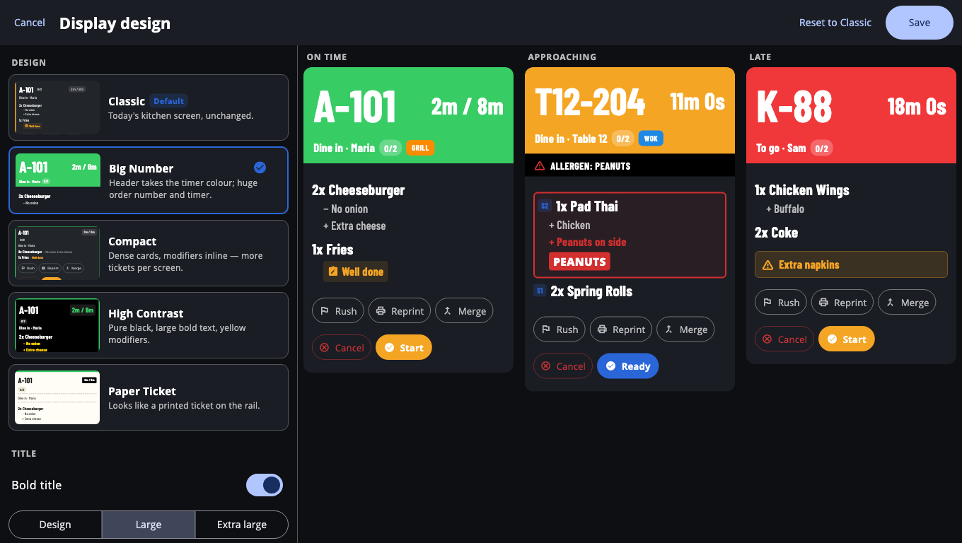
Pick one of five ticket designs, a font, title size, theme and text size for each kitchen screen, with a live preview.
On this page
Each kitchen screen can have its own look. Your choice is saved on that screen only.
Pick a design#
- On the kitchen board, open Settings (gear icon).
- Tap Display design.
- Under Design, pick one:
- Classic — the standard kitchen screen.
- Big Number — huge order number and timer; the header takes the timer colour.
- Compact — smaller cards with options on one line, so more tickets fit.
- High Contrast — pure black, large bold text, yellow options. Good for bright kitchens.
- Paper Ticket — looks like a printed ticket on the rail.
- Adjust the rest if you like:
- Title — Bold title and the title size (Design, Large, Extra large).
- Card details — Show dining type on cards (Dine in / To go next to the customer name).
- Font — Design default, System, Open Sans, Condensed, Mono or Rounded.
- Theme — Dark or Light.
- Item text size — make item text bigger or smaller.
- Watch the preview. It shows three sample tickets: on time, nearly late and late.
- Tap Save. To go back to the standard look, tap Reset to Classic.
Other display settings#
In Settings on the board:
- View mode — Kanban (New / Preparing / Ready columns) or Stations (a column per station).
- Light theme and Font size for the whole board.
- SLA target (minutes) — when a ticket turns late (shows Over …m).
- Ticket buttons — All buttons on each ticket, or Large button + ⋮ menu to save space.
Good to know#
- High Contrast cards are always black and Paper Ticket cards are always paper-white, whatever theme you pick.
- The preview never changes real tickets.
- Printed kitchen tickets have their own designs in BuiltOFFICE's Receipt Designer. See Receipt designer.
Was this helpful?
Thanks for letting us know.
Sorry it did not help. Tell us what was missing: open Help & Support in the app and choose Report a problem, or email support@builtsofthub.com.